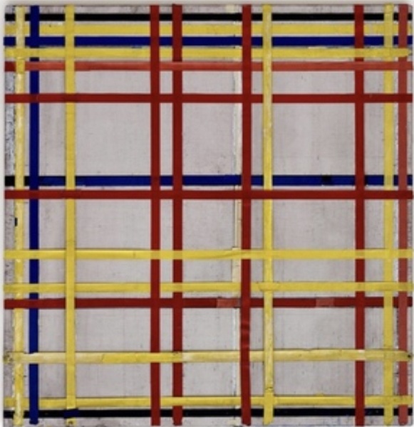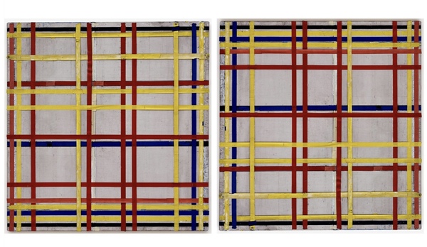
I like Mondrian but am not a particular fan of this pic. I think it looks completely different hung “the wrong way”. Have a look at some of his still life and landscape pictures which are beautiful if you’re not a fan of abstract.
It looks like a picture of the school climbing frame when it’s put away against the wall. I’m sorry, I’m a Philistine where art is concerned, unless it looks like something I recognise.
I would hang it as the left picture. But, seeing the two together, the right is more dynamic by far. Just lines and colours but they convey subtle meanings. I suppose that's the mark of a true artist?
I assume the design is supposed to represent the grid pattern of the streets and avenues of Manhattan, in which case the one on the right looks more accurate.
It looks like a picture of the school climbing frame when it’s put away against the wall. I’m sorry, I’m a Philistine where art is concerned, unless it looks like something I recognise.
I would hang it as the left picture. But, seeing the two together, the right is more dynamic by far. Just lines and colours but they convey subtle meanings. I suppose that's the mark of a true artist?
The meanings are too subtle for me 😁 Unless he is meant to be gazing out through prison bars?
However, as fabric design it would be ok. I prefer the left hand picture, the one on the right is top heavy.
I have downloaded it and tried it all 4 ways BTW. The heavy lines at the top make me think more of New York, tall buildings and narrow streets.
It also looks interesting with the heavy lines on the left. It "feels" very different that way. I don't like it so much with the "weight" at the bottom.